
Visual Identity
Our visual identity system forms the foundation of Simio’s brand expression, creating immediate recognition and reinforcing our position as leaders in digital twin simulation technology.
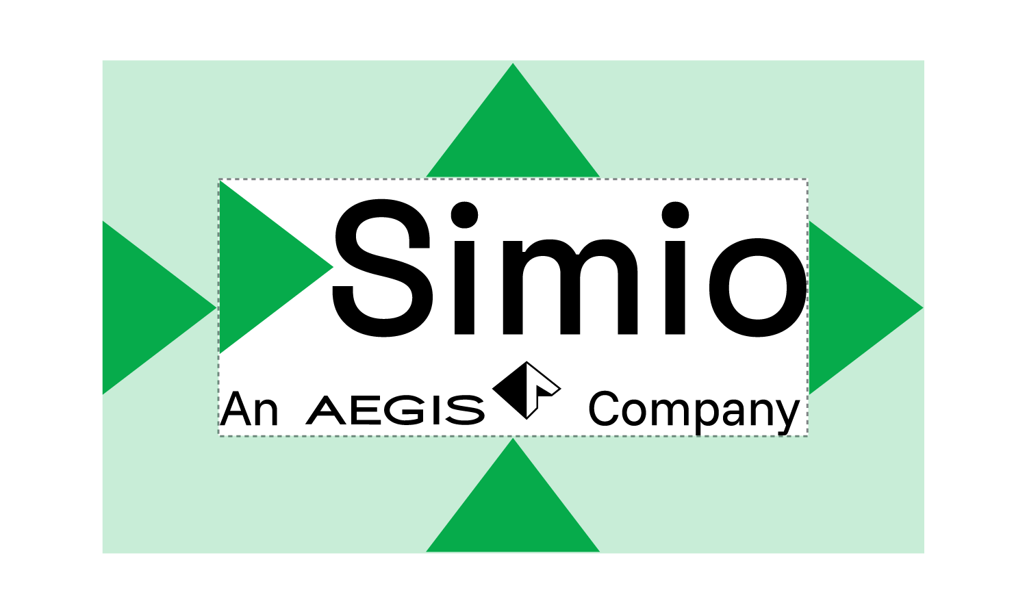
Simio Logo Brand Signature
The Simio Logo Brand Signature is the cornerstone of our visual identity, embodying our bold, timeless, and technical approach. Consisting of our distinctive triangle mark, wordmark, and “An Aegis Company” tagline, this signature has been carefully crafted to reinforce Simio as a trusted developer of simulation software.
Signature Components
Triangle: This distinctive visual identifier anchors our brand signature. Its visual relationship to the wordmark is precisely designed and should never be altered or repositioned.
Wordmark: The Simio wordmark features adjusted letterforms that cannot be replicated through typesetting. Always use the approved artwork files rather than attempting to recreate the wordmark.
Tagline: Our “An Aegis Company” tagline may be omitted in certain circumstances where space is limited or when the signature appears at smaller sizes.
Signature: Together the triangle mark, wordmark and tagline are known as the brand signature
Signature Clear Space
Clear space is the protected area around the signature that maximizes its impact. This space must be kept free of all other graphics and text, including other logos. It is also the minimum distance the signature can be from the edges of an electronic document or printed piece.
To preserve the signature’s prominence, no additional iconography, marks or artwork may be used in conjunction with it or any secondary signature.
Approved secondary identity elements may be used as supporting art, but they should always be clearly delineated from the signature.
Defining Clear Space
Clear space is defined using the triangle mark in the signature. The minimum clear space equals the width of the triangle mark and should be maintained on all sides of the signature. This ensures the signature remains visually distinct and its impact is not diminished by competing elements.

Minimum Size
To ensure legibility and brand integrity, the Simio signature must never appear smaller than:
- Print applications: 1.20 inch (44.45 mm) in width
- Digital applications: 115 pixels in width
- When using the signature with tagline, maintain a minimum width of 1.20 inch (44.45 mm) for print and 115 pixels for digital applications
For applications requiring a smaller brand presence, use signature without the tagline, which should never appear smaller than 0.25 inches (6.35mm) or 18 pixels.
Signature Color Usage
Consistent application of our signature colors is essential for maintaining brand integrity across all touchpoints. The Simio brand signatures are fixed pieces of art that represent our identity in its most distilled form. To preserve their impact and ensure consistent representation, never attempt to recreate a signature from scratch or alter the artwork in any way. Adding strokes, glows, shadows, or other design effects around or behind the signature compromises our brand integrity and is strictly prohibited. These guidelines ensure our brand maintains its professional appearance and instant recognition in all applications.
Full Color Signature
The full color signature is the recommended format version and should be used whenever possible. This version best represents our brand and creates the strongest visual impact.
Limited Color Signature
For instances when the full color signature is not appropriate, a 1-color solid black or white version has been created to ensure the brand signature reproduces at the highest quality. These versions should be used when technical limitations prevent the use of the full color signature or when placed on backgrounds that would compromise its visibility.
Logo Do-Nots
To protect the integrity of our brand, never:
Add strokes, glows, shadows, or other effects to the signature
Use the full color signature over dense photography or complicated backgrounds
Attempt to recreate the signature using other fonts
Distort, skew, or stretch the signature beyond its original proportions
Create custom colorways not specified in these guidelines
Separate the triangle mark from the wordmark unless using the approved standalone mark
Color Palette
The brand look is established using this set of signature brand colors. Our color palette is strategically designed to communicate Simio’s brand attributes while creating visual impact across all applications. The brand relies heavily upon the use of clean white space to balance the richness of imagery and the vibrancy of the color palette.
Primary Colors

Simio Green
Our signature green represents growth, innovation, and forward momentum, reinforcing our “Forward Thinking” positioning. This vibrant green creates associations with progress and sustainability, reflecting our role in helping organizations optimize their operations.
C: 93 M: 0 Y: 52 K: 34
R: 11 G: 169 B: 81
HEX/HTML #0ba951
PMS 7482 C

Global Green
This deeper green provides depth and sophistication to our palette, complementing our signature Simio Green while adding visual weight to important elements.
C: 77 M: 0 Y: 51 K: 50
R: 30 G: 128 B: 63
HEX/HTML #1e803f
PMS 7731 C

Digital Dark
This rich, deep tone creates sophisticated contrast and serves as an ideal background for our vibrant greens. Digital Dark reduces eye strain in low-light environments and creates a modern aesthetic that enhances content visibility.
C: 82 M: 15 Y: 0 K: 87
R: 6 G: 28 B: 33
HEX/HTML #061c21
PMS 6 C

Simio Black
Pure black provides maximum contrast and clarity for text and critical information, ensuring readability and accessibility across all applications.
C: 0 M: 0 Y: 0 K: 100
R: 0 G: 0 B: 0
HEX/HTML #000000
PMS Black C

Simio Grey
This light grey creates subtle contrast and provides breathing room in layouts, enhancing readability and visual hierarchy.
C: 0 M: 0 Y: 0 K: 14
R: 220 G: 220 B: 220
HEX/HTML #DCDCDC
PMS 5315 C

Simio Silver
Our silver tone adds sophistication and balance, complementing our more vibrant colors while adding a sense of maturity and stability to our visual communications.
C: 4 M: 2 Y: 0 K: 40
R: 147 G: 150 B: 153
HEX/HTML #939699
PMS 7 C
Accent Colors
Secondary accent colors have been chosen to feel connected to the primary brand colors and add range and modernize our brand. These colors should only be used when a wider color palette is needed.

Cyber Green
This electric green creates energy and draws attention, making it ideal for highlighting key information and interactive elements.
C: 44 M: 0 Y: 78 K: 5
R: 137 G: 243 B: 54
HEX/HTML #89f336
PMS 7488 C

Augmented Aqua
This vibrant aqua tone adds a futuristic quality to our palette, perfect for feature highlighting and creating visual interest in digital applications.
C: 100 M: 0 Y: 6 K: 0
R: 0 G: 255 B: 240
HEX/HTML #00fff0
PMS 311 C

Vivid Orange
Orange creates energy and draws attention, making it ideal for calls-to-action and important highlights that require immediate user attention.
C: 0 M: 35 Y: 100 K: 0
R: 255 G: 165 B: 0
HEX/HTML #ffa500
PMS 311 C

Illuminating Yellow
This bright yellow captures attention and signals important notifications or alerts, creating immediate visual priority.
C: 0 M: 16 Y: 100 K: 0
R: 225 G: 215 B: 0
HEX/HTML #ffd700
PMS 012 C
Gradients
While our brand relies primarily on solid colors and white space, gradients may be used selectively to add depth and dimension to specific design elements. When implementing gradients:
- Use them sparingly and purposefully
- Maintain consistency with our brand color palette
- Ensure sufficient contrast for text legibility
- Consider accessibility requirements
The thoughtful application of gradients can enhance our visual identity while maintaining the clean, sophisticated aesthetic that defines the Simio brand.

Simio Green to Digital Dark

Simio Dark Green to Digital Dark

Simio Green to Simio Dark Green
Typography
Our typography system balances technical precision with clarity, ensuring our communications are both authoritative and accessible to our audience of industrial engineers and operational decision-makers.
Space Grotesk
Space Grotesk is our go-to display typeface, used for headlines and accents across all brand communications. As a modern variant of the Space Mono family, this sans-serif font strikes the perfect balance between technical precision and readability, aligning seamlessly with our brand’s identity.
With its geometric design and subtle technical details, Space Grotesk embodies our commitment to simulation accuracy and engineering excellence. It’s the ideal choice for headlines, navigation, and feature callouts, delivering a clean and professional look.
Characteristics
- Sans-serif proportional design with distinctive technical character
- Available in multiple weights from Light to Bold
- Supports Latin, Vietnamese, and Pinyin languages
- Features OpenType capabilities including old-style numbers and fractions
Applications
- Headlines and subheadings
- Navigation elements
- Pull quotes and callouts
- Technical specifications
- Interface labels
Funnel Sans
Funnel Sans is our primary typeface for body text, offering exceptional readability with a sleek, modern aesthetic. Created by NORD ID and Kristian Möller, this sans-serif font combines square and circular elements, perfectly complementing Space Grotesk while ensuring clarity for longer text.
Optimized for marketing and data visualization, Funnel Sans is the perfect fit for body copy, detailed explanations, and interface text—anywhere readability is key.
Characteristics
- Clean, modern sans-serif design
- Data-inspired geometric forms
- Excellent readability at small sizes
- Balance between functionality and aesthetics
Applications
- Body copy
- Detailed explanations
- Interface text
- Data labels
- Supporting information
Typography Guidelines
- Headlines: Use Space Grotesk Bold or Semi-Bold for headlines and section titles
- Subheadings: Use Space Grotesk Medium for secondary headings
- Body Text: Use Funnel Sans Regular for body copy and detailed information
- Technical Content: Use Funnel Sans Light for specifications and technical data
- Callouts: Use Space Grotesk Medium for emphasized content
Maintain clear hierarchy through consistent size relationships between headings and body text. Use sentence case for headings and titles, avoiding all caps except for acronyms and abbreviations. For digital applications, ensure minimum font size of 14px for body text to maintain readability.
Our typography choices reflect Simio’s commitment to balancing technical sophistication with accessibility—ensuring our communications are both authoritative and approachable for our audience of industrial engineers and operational decision-makers.